
Creating Inclusive Digital Spaces Through Information Architecture
BACKGROUND
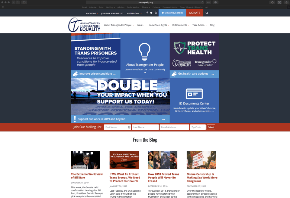
This work was not done in partnership with National Center for Transgender Equality (NCTE). This project was completed as a case study to understand how information architecture can be used to help create inclusive digital spaces.
Challenge:
Define the audiences and create a website navigation that serves those audiences equally by using inclusive and neutral language.
Audiences:
Audiences were defined by reviewing the content on the NCTE website. Through this review it became clear that there were three distinct audiences being served.
Trans folx
Advocates of the LGBTQ+ Community
Folx from outside the LGBTQ+ Community
PRIORITIES
The use of inclusive language in navigation
An easily understandable hierarchy
Language and navigation that better serve all audiences on one site

APPROACH
Understand the current language
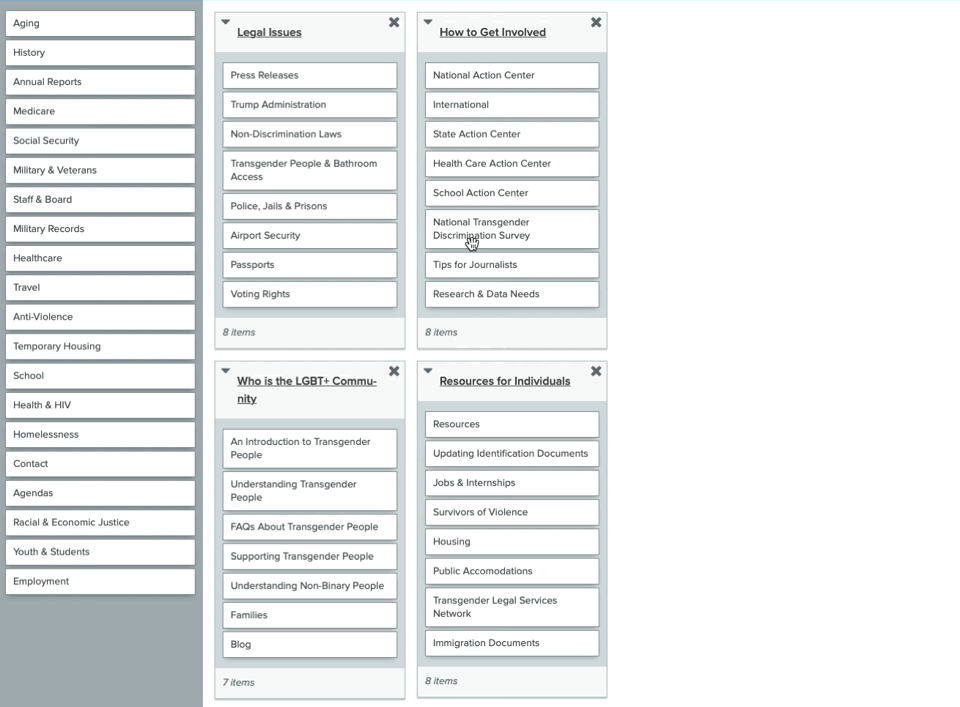
The National Center for Transgender Equality is using language in their navigation that could be exclusionary, or turn people away from learning more. Updating this language can ensure that every visitor feels welcome on the site. To understand this language, moderated and unmoderated card sorts were conducted with each audience type. Moderated card sorts offered a in-depth understanding of how each audience responded to the current language. Unmoderated card sorts offered a broader understanding that supported the findings from the moderated sessions.
Optimize research findings
Moderated card sorts were conducted with three members of each audience type. Unmoderated card sorts were shared through multiple social media platforms and received a total of 55 total participants: 22 trans folx, 15 allies, 17 folx from outside the LGBTQ+ community. The findings from these tests revealed common patterns of understanding in each audience type. With those patterns and the qualitative data from the moderated sessions, a new inclusive navigation started coming together.


Create Recommendations
For this unique problem, it was incredibly important to take into consideration the reasons behind the language created by each audience, and their understanding of the content being provided. The recommendations for this navigation are based on who the content behind each navigation section is for, and the use of language that won’t turn away the other audiences. The use of inclusive, and neutral language was also a big drive behind these recommendations — inclusive language creates an encouraging and welcoming digital space for each audience type.

Outcomes
An understanding of how the three audiences being served understands the content.
Identification of language that felt exclusionary, off-putting, or was unclear through moderated card-sorting sessions.
A recommended navigation that allows any user to feel welcome and understand what content can be expected throughout the site.

In March of 2019 this case study was presented at the Information Architecture Conference in Orlando, FL. Creating Inclusive Digital Spaces Though Information Architecture was very well received and after many requests an encore webinar was put together.
In November of 2019 this case study was presented at Brooklyn Product Design’s 2 year anniversary. This meetup was covering the topic Considerations in Considerate Design. Click through below to watch.
Watch video from Brooklyn Product Design’s night of Considerations in Considerate Design.